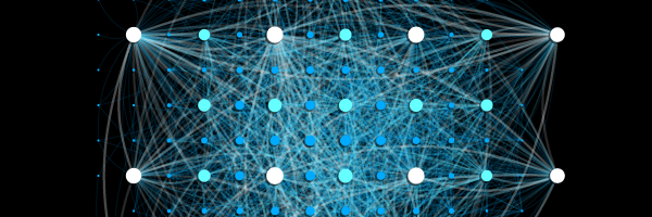
Have you ever wondered how many new connections you made at a conference? If you attended Eyeo 2012, you might be able to find out exactly how many with this visualization from Jeff Johnston.
This paper.js based visualization uses Twitter and Lanyrd to map out and compare attendee’s twitter followers before and after the conference. It’s a deceptively simple and attractive way to show a whole lot of information about the attendees and their followers related to the event. If you were at Eyeo, find yourself on the map and see how your connections changed. It’s still worth checking out even if you weren’t. The data might surprise you.
Twitter connections before and after Eyeo 2012
by Jeff Johnston

