
In flight is a four part interactive infographic documenting 100 years of air travel. It’s a very well crafted HTML5 experience. All four parts of the project are preceded by guided animation and voiceover to explain the point being made and the data that supports it. The user is then free to explore the data before moving on.
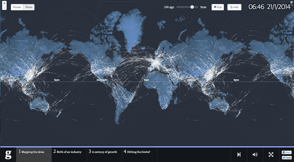
- Mapping the skies is a modern interpretation of Aaron Koblin’s Flight Patterns project, but computed from live data.
- In birth of an industry we travel to Tampa Bay, Florida to hear about the the beginnings of commercial air travel.
- A century of growth charts ticket sales and the reasons behind their staggering rise over the last 100 years.
- Hitting the Limits looks at the projected growth of air travel and if the projected numbers are actually sustainable.
The project was developed for The Guardian by London data specialist Kiln. Founded by ex Guardian employees, Kiln specialise in using interactive data to tell stories. Members of the project team include Duncan Clark, Robin Houston, @effisfor and @franpanetta.