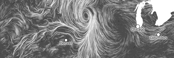
Wind Map is a captivating visualization of wind data across the United States built with canvas. The swirling map takes an invisible force that surrounds us every day and makes it visible from a birds-eye view. The wind patterns are beautiful to watch and are nearly realtime. The data behind them comes from the National Digital Forecast Database. Click to zoom in and you’ll get even more detail, including the speed and direction of wind in any particular area as it blows by.
Wind Map is a personal art project from Fernanda Viegas and Martin Wattenberg, both of whom work for Google’s “Big Picture” data visualization group by day. They talk about the process and motivations behind the project and more in this Eyeo Festival talk.
Perhaps a testament to how useful of a visualization this is, it seems some people have mistaken it for being more accurate than an art project could ever aim to be. Which lead to a bit of a disclaimer on the site:
We’ve done our best to make this as accurate as possible, but can’t make any guarantees about the correctness of the data or our software. Please do not use the map or its data to fly a plane, sail a boat, or fight wildfires

Go be mesmerized by the patterns of Wind Map, but please consult a more boring manual or forecast before heading out on your sail boat 
Wind Map
Eyeo Festival talk
Fernanda Viegas
Martin Wattenberg

